
 Demo SourceForge
page Wiki
Demo SourceForge
page Wiki
|
|
Latest
New Wiki
Our Wiki gives you a place to share ideas and advice with other folks. We've started it off with some instructions about how to get Java applications to use Napkin for their Look and Feel.Latest Release: 1.2, 12 May, 2009
Overview
The Napkin Look & Feel is a pluggable Java look and feel that looks like it was scrawled on a napkin. You can use it to make provisional work actually look provisional, or just for fun. It is released under a BSD-style license The idea is to try to develop a look and feel that can be used in Java applications that looks informal and provisional, yet be fully functional for development. Often when people see a GUI mock-up, or a complete GUI without full functionality, they assume that the code behind it is working. While this can be used to sleazy advantage, it can also convince people who ought to know better (like your managers) that you are already done when you have just barely begun, or when only parts are complete. No matter how much you speak to their rational side, the emotional response still says "Done!". Which after a while leads to a later question: "That was done months ago! What are they doing? Playing Quake?" A good article on this is Joel on Software's “The Iceberg Secret, Revealed”. So the idea is to create a complete look and feel that can be used while the thing is not done which will convey an emotional message to match the rational one. As pieces of the work are done, the GUI for those pieces can be switched to use the "formal" (final) look and feel, allowing someone looking at demos over time to see the progress of the entire system reflected in the expression of the GUI. Over time, several folks have just liked the thing and wanted to use it for non-provisional GUI's. Sometimes this is because the application itself seems to match the theme, such as a brainstorming tool. And sometimes it's just that it looks fun. This is all done using the Java Swing pluggable Look & Feel framework.Snapshots
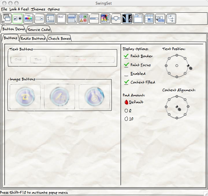
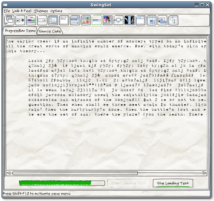
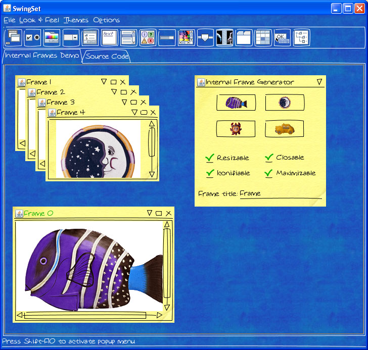
To give you a feel for what this looks like, here are a few screen snapshots (as thumbnails; click for full-sized images):


Development
 Ken Arnold |
 Alex Lam S.L. |
Sightings
- Don't make the Demo look Done, from Kathy Sierra's blog Creating Passionate Users.
- "Finally, it's great to know that there are tools to help make the look match the state, with my favorite being the Napkin Look and Feel, a GUI "skin" for Java that makes the interface look -- quite literally -- like it was scrawled on a napkin."
- Matt Stephens' “Agile Development with ICONIX Process”
- "... if the working prototype was presented looking like a user interface mockup that had been scrawled on theback of a napkin, then the customer would be more likely to see it for what it actually is: a slightly working but mostly non-functional prototype... Seems like a great idea to us!" (You can read the pages here)
- NetBeans Look & Feel Competition
- Claudio Miranda submitted an entry with NapkinLAF on GTK.
- Kirill Grouchnikov's blog
- Compares various LAFs for their Right-to-Left menu alignment issues. Thanks to Kirill for reporting the issues ;-)
- BlogEd
- "I have added the napkin L&F to BlogEd and made it the default when run from cvs using 'ant run'. We can easily change it back if it gets in the way. The only bug I have noticed currently is that the pulling on the scrollbar seems to move the whole window. Perhaps Ken Arnold will know what the problem is there."
- Daniel Steinberg's blog at java.net, April 5, 2004
- A very nice & quick writeup.
- Front page note on javadesktop.org , April 1 2004
- Just a brief note pointing to the home page, but we got some good mail from it.